Instead of…

firing the stringer pot upside down….you could just invert it (duh):

Downside up

Downside up


I think it looks better, My wife doesn’t.


You could also put pots one on top of the other to reach a particular height, or inside one another for a variation. These are for demo only and are obviously not designed to go together.

IMG_2999 IMG_3001


Lastly…

I am pleased with this. It is my first attempt to synthesize translucency with figuration. And it’s worked quite well.

IF YOU CLICK ON AN IMAGE IT COMES UP FULL SIZE (EVEN THUMBNAILS)

Head 25 x 22cm

Head 25 x 22cm

I made this using a porcelain head that I had sculpted some time ago as a mould. I coated it with batt wash to minimise sticking (learning from my experience with mould at UCLan (more later)) and then laid 3 layers of ppcs soaked fibreglass over it, stroking each in to position to minimise lines on the face. It had to be dried for some time with a hair dryer as the underlying mould is completely non absorbent. Removing the cast was interesting. As I pulled it off it everted like a sock – so that what is visible is the inverse of the mould. Hence the eyes curve inwards. Fortunately, despite the drying it was still quite moist and so it didn’t crack. However, it did lose a lot of its shape and become v irregular. Definitely a first draft of the technique.

Han-Solo-Carbonite

Han-Solo-Carbonite


I have to say, too, that its a bit like Han Solo trapped in the Carbonite by Jabba the Hutt. I didn’t anticipate that.


Here it is in profile:

Profile

Profile


and in different colours:

White LED

White LED

Blue Filter LED. Daylight

Blue Filter LED. Daylight

Red Filter LED

Red Filter LED

Purple Filter

Purple Filter


Blue Filter LED. Dark

Blue Filter LED. Dark


Next step is to try plaster moulds.

More pots in the fire

I tried some other experiments:

1) Usual cylinder, with blue 1mm glass stringers placed vertically and layered between 2 ppcs soaked layers of fibreglass. Placed a piece of red coated paper with them but it is v faint. The glass has melted and run. Might look more interesting if fired upside down.

Blue Stringers. Close up. 18 x 7 cm

Blue Stringers. 18 x 7 cm

Blue Stringers. Blue light

Blue Stringers. Blue light


2) Vermiculite inclusions with an area kept clear using paper stencil. Unsuccessful – the Vemiculite remained enclosed in the ppcs, burned out but left its sad little ashes in their ceramic grave – rather than doing the decent thing and going up the flue. So – no holes, only dark burials. Next time the inclusions need to be bigger and to penetrate the outer (or inner ) surface of the ppcs so the ash can be removed, leaving a more translucent surface. On the other hand the use of less gobby inclusions might be interesting.

Vermiculite graveyard. 17 x 6 cm

Vermiculite graveyard. 17 x 6 cm

3) Like this:

Paper coloured with red & blue colourant. 16 x 10cm

Paper coloured with red & blue colourant. 16 x 10cm


Drum firing complete

The drum shapes worked well. I’ve shown them in incandescent light and LED, plain and filtered blue and red. The sides of the one shown in the last post has not warped at all, showing the strength of the seams. The final overlap is discernible by its slight loss of angle. Both the tops have warped inwards – but both the bottoms stayed flat, suggesting that firing upside down may leave the top intact with the bottom being warped but invisible. An alternative (more difficult) would be to give the top a slight dome, hoping it would level out.

Drum 6 segments, stamped

Drum 6 segments, stamped. 13 x 14cm

Drum Final seam

Drum Final seam


Cobalt blue colourant on cotton.

Cobalt blue colourant on cotton. 13 x 14cm

1 of 4 seams, giving a squarish profile

1 of 4 seams, giving a squarish profile


Close up of stamp

Close up of stamp, blue light. Detail clearer

Cotton drom, red light

Cotton drum, red light


Drum

Following DB’s advice to use 2 seams so there isn’t a ‘back’ I woke up one morning with the idea of 6 seams leaning Right and 6 Left. I drew it and assembled it. My cardboard former is 50cm diameter

IMG_2946

IMG_2929


The fibreglass membrane is on the plaster batt and I am painting on the second layer of ppcslip

IMG_2931


Accurately cutting the right sloping sections. These will then ann be joined with a 5mm joint and rolled

IMG_2935


This is then repeated sloping left and cutting through the previous seams. When the joints are made the previous seams are 0.5cm out of alignment. Looks ok though.

IMG_2939


Then It’s stamped using 2 wooden stamps and formed round the cardboard tube.The final overlap was just over 5mm (gratifyingly).

Meanwhile I had prepared a top and bottom. The bottom was cut with a central circle for a light fitting and the top cut with a diamond shape with the same proportions as those on the sides.

The clay is still wet and transmits the light nicely, indicating what it will be like if it survives the single firing.

From inside

From inside 

Showing width of wall

Showing width of wall


Lit with LED

Lit with LED

New Batch

2 thrusts to my work this week

  1. the stuff shown in the penultimate post
  2. Fibreglass membrane and ppcs. I used cotton soaked in CoBlue, some coloured glass stringers, home made stamps for imprints and the Moire pattern technique referred to in the ideas section. This is achieved using craft stamps with lots of regularly spaced holes. One is rolled on to the setting slip and another slightly offset and rotated, rolled on top. Clean edges are achieved using a piece of thick paper to define them and prevent the moire imprint from coming through. Also did it in layers, a la Sasha Wardell, with same intention. Scraped back when dry with a Stanley Knife Blade. Went for something more organic and less precise with the shapes scraped back.

Amazingly translucent when wet.

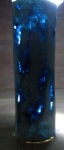
The firing was successful The batch where the clay was air heated before rolling came out as expected and has a pleasing randomness about it:

IMG_2901

IMG_2899

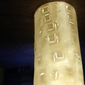
The ppcs pieces were better, especially the one with the Moire pattern on it:

IMG_2896  IMG_2895

When I showed it to DB he seemed pleased  with it. He felt that the pattern gives depth to surface and he liked the cotton line effect. Being a minimalist he felt, and I agree, that it might be better to separate the 2 techniques. The irregularity of the outline is probably unavoidable and he suggested even encouraging it and accepting the limitations of the material. Suggested 2 joins, rather than one, to avoid there being a ‘back’ to the piece. Talked about differently shaped structures, height, width,etc

The layered piece was a curates egg. Again. The clover red colour was over fired and extinguished. The colour was otherwise 2 intense to permit translucency except where it was scraped so thin that the inner scaup blue was almost eroded through to the underlying white.

The test pieces did what they were supposed to

Hand Made Stamps

Hand Made Stamps

Various imprints/colouring

     Various imprints/colouring

Paper with spread colour

Paper with spread colour

Remains od pieces with stringers

Remains of pieces with stringers

The glass will have fluxed the clay – hence the tile broke, but there is potential here.

Review with DB

Dave wanted to review progress to date. We spoke about my work and reviewed it using the blog. He feels the project in relation to translucency is worthwhile. Seemed pleased with what I have achieved so far. Observed that the use of a top on a cylinder is likely to be effective but wondered whether I could use setters instead. Same principle, but removable. Of course….a little more complex but it leaves more freedom. Also wondered if I felt wedded to the idea of a vessel. No – it is a convenient way of displaying the translucent surface. He suggested other stable shapes – eg a boat shape with the strength in the ‘keel’ – upside down. Box shapes. Discussed possible warping and I suggested making flat sheets, already cut to size, and assembling afterwards with cyanoacrylate or epoxy resin. Dave thought that was fine. Need to vary shape is considerable as cylinders a bit boring. He raised the issue of mixed materials, using wood/glass/metal to mount the porcelain. I have discussed this in an earlier post and absolutely agree.

Assignment – agreed that I could mix Literature and Contextual Reviews. I feel that there would be too much cross-referencing between the 2 assignments as I would have to contextualize statements in the Lit review. This would be avoidable if both part of same argument.

I have mentioned a survey in V2 of my Learning Agreement. This is something for next semester as an exploration of the views of other artists emotional and aesthetic responses to translucency. So this semester is my exploration of the topic and next sem’ deepens and generalises it.

Need to discuss learning agreement in more detail