I’ve been doing my assignment (in on time), Christmas for endless streams of family, rugby stuff, and just recently preparing this term’s assignment – a survey of ceramic artists who use translucency, looking at emotional, perceptual and aesthetic intentions and responses to translucency. The relevant literature in semiotics and aesthetics is actually more interesting than I dared hope. That’s a sentence I never thought I’d write! I hope DB thinks it’s ok as a proposal. Then I’ll need to get some stats advice from the University and some translations. I can get German & Japanese done.
DB showed us some throwing techniques last week and I spent a fun afternoon making vessels. Not good, it’s true, but definitely better than I expected. None survived because I sliced them all to ensure the cross section was ok. Which it generally was. I would hope, at least, to use these rudimentary skills to make moulds for my layered stuff. Maybe even some proper potter’s pots.
The final event last term was a Show & Tell of our recent work. I was anxious but the group were kind. That was the last stuff I made:
Usual technique. Also used coloured glass powder (frit), mixed with slip (ad hoc, no proportions) to see if I could include it in the layers, or use it as surface colour. Mixed with clay so it could be painted on. Recently wondered if it could be mixed with dilute gum arabic for same effect. With clay the colour is significantly diluted. Could also add colourant (oxide or fritted colour) to the mixture. In the layers it fluxes the clay til it bloats so I don’t think that will work.
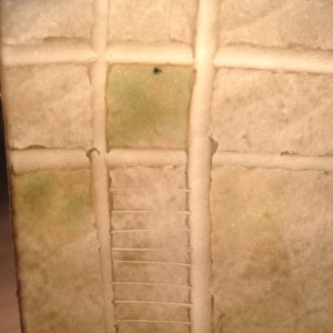
Surface glass frit. Started off aquamarine!
The ‘ladder’ was made by touching the wet slip with the edge of a piece of card.

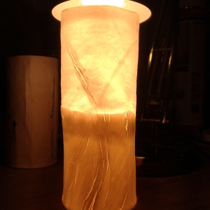
Flat piece, fired at 1270C standing on a shelf support, then inverted to make a bowl. Technique derived from glass slumping.
The fluxed glass is clear here:

Bubbles!
This didn’t work. It is a combination of fibreglass layered slip at the top with rolled ppc luted to the bottom. Attempted to achieve some consistency by carrying on the lower inclusions into the upper area with slip indented with edge of paper. The junction looks awful. Maybe some good will eventually come of it. But this isn’t it.
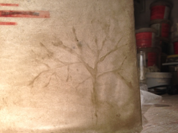
Tree silhouette using painted, uncoloured ppc slip

Coloured paper in the layers. At the top is a stamp mark
And so on to a new term…….
.


