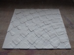
Showed my framed image pieces, and those cast on plaster, the horse and the abstract rectangle piece in addition to cube.
-

- Transmitted. LED Panel
-

- Ladies in Burquas. Transmitted
-

- Horse. Reflected
-

- Transmitted
-
- Reflected
-

- Transmitted
Explained how I had got to where I am for Anna’s benefit and reviewed work this year. It wasn’t obvious that Dave or Anna were familiar with the contents of my blog – but maybe they were just being cagey. Points arising:
- Still no clear mark making style
- I explained that ‘cube’ is a step in that direction. Dave commented that, as it is currently constructed, it is a move away from using translucency. It is attractive, and I may choose to pursue the idea but it’s not the original point. True.
- He commented on my inability to draw and the consequent implications for mark making, thru printing etc, of borrowing images (as in ladies in burquas). Anna raised issue of the aesthetics of the coloured sheets in a frame – essentially “what more?”
- Reviewed the attractiveness of the cube with cup, plate and saucer. Dave asked if the cobalt blue was a deliberate evocation of Willow Pattern. It was (see Dec 22 – “I thought it would be amusing to suggest willow pattern ware by colouring some of the discs with Cobalt Blue and randomly distributing them through the image.”)
- Long discussion of implications for Final Show
- DB said that, despite his initial enthusiasm, he is now uncertain about my (or, I think, anyone else’s) capacity to complete a task as enormous as the installation we have discussed within the time scale available.
- Anna pointed out the difficulties in obtaining a suitably high quality finish for public display.
- These comments were made in the context of having to spend time doing other work for the show and having to work alone. The very strong message was that an installation of the type previously discussed was probably biting off more than I could chew. When I specifically asked the question both DB & AL said they felt I should set my sights lower and that their encouragement was a bit premature. This is both a disappointment and something of a relief. I have been giving a lot of thought to the technical aspects – with some trepidation.
- Suggestions were made for future progress:
- Use frames, and strings, but narrower. This will facilitate lighting and ‘jiggling’ effects whilst limiting footprint
- Emphasize translucency, using thickness modification primarily, supplemented with print/colour
- Sheets can be strung within frames, in overlapping layers, to make screens – vertical or horizontal. My thoughts:
- Obviously, lighting could be from above, below, the sides or behind
- Combinations of sheets and discs are possible
- Important to keep frames minimal and emphasise porcelain. Not sure I agree with this since the contrast between an ‘industrial’ style frame and ethereal image would dramatic
- I showed them drawings for lights.
- The first was a series of cones and cylinders mounted one on top of the other, joined and supported up the centre by a steel pole. This would have LED strip on 3 sides to illuminate.Dave seemed to like the idea of it and likened it to Brancusi’s ‘endless column’ in Targu Jiu, Romania.


The second was a cylindrical light, lit from above and below by focusable spotlights, and supported in a steel frame. The idea is that it looks as if it is floating. No comment, so I don’t know what they thought.
This assessment contributes 20 marks. I have absolutely no idea what I will score. I came out feeling that I had in some way disappointed them. My projection?


 http-:bit.ly:1BoQfPe")


